
INTRODUCTION
Background and Motivation
HOW do we represent sound and music visually? This issue has been addressed by scholars from various disciplines to shed light on questions such as how we perceive motion in music (Repp, 1993; Godøy, Haga & Jensenius, 2006), how auditory information is processed and mapped onto the visual domain (Marks, 2004; Spence, 2011), how children develop an understanding of rhythm (Bamberger, 1995) and represent music graphically (Reybrouck, Verschaffel, & Lauwerier, 2009; Verschaffel, Reybrouck, Janssens, & Van Dooren, 2010), and how musical training influences the ways in which we represent short but complete musical compositions visually (Tan & Kelly, 2004). The idea that musical training affects how adults hear music has been around for several decades (Sloboda, 1985), including the belief that experts and novices listen to music differently (Gromko, 1993) and that musical training leads to adults paying more attention to the structural properties of musical stimuli that they hear (Sloboda, 1984). Consequently, this may lead to substantial differences in the shapes produced by musically-trained versus musically-untrained individuals, reflecting different ways of processing sounds.
The research strands outlined above have in common that they can be grounded in, or related to, theories of multi-modal perception (Stein & Meredith, 1993), embodied music cognition (Leman, 2007) and gestures (Godøy & Leman, 2010; Gritten & King, 2011). Likewise, the visualisations of sound and music discussed here involve auditory, visual and kinaesthetic senses that are integrated to form a holistic experience when sounds are rendered visual through bodily movements (i.e. gestures).
As described by Küssner (2013b), previous studies have investigated both how trained individuals link visual shapes and music and how adults with limited musical background visualise music. However, none of these studies looked at visual representations of basic components of music (such as pitch or dynamics) in real-time, nor have they involved technological tools that allow a direct comparison of the evolution of visualisations concurrent to changes in sound. However, time-dependent analyses are not new in music psychology (Schubert & Dunsmuir, 1999), and have been used, for instance, to model emotional responses to music with non-parametric correlations (Schubert, 2002) or Functional Data Analysis (Vines, Nuzzo, & Levitin, 2005), or to analyse gestural responses to sound with Canonical Correlation Analysis (Caramiaux, Bevilacqua, & Schnell, 2010; for a critical review of various analytical tools see also Nymoen, Godøy, Jensenius, & Torresen, 2013). While correlational approaches take into account temporal aspects of the data only indirectly, Functional Data Analysis is not suited for studies including participants' responses to numerous sound/music stimuli, and is rather used to compare multiple responses to few musical excerpts and/or experimental conditions (e.g. Vines, Krumhansl, Wanderley, & Levitin, 2006). Thus we apply various mathematical techniques to a dataset that has been analysed previously (Küssner, 2013a; Küssner & Leech-Wilkinson, 2013), to show how advanced mathematical tools can aid analysis in an attempt to create a more complete understanding of the way people think about and visualise shape(s) in response to sound and music.
First, we briefly describe the original experiment and report findings that have emerged from previous analyses. Then, we demonstrate how advanced regression modelling techniques can be used to reduce the dataset, making it more manageable for further analyses while losing only minimal information. Next, we perform clustering analyses on the reduced dataset to investigate the extent to which meaningful groupings emerge from the data. We also run classification analyses to examine the possibility of automatically classifying participants' drawings as belonging to either the 'musically-trained' (hereafter trained) or 'musically-untrained' (hereafter untrained) categories and, if successful, what the implications might be for the ways in which musical training shapes cognitive processes. In all stages, the analyses will progress from simplistic to more complex in an attempt to find the best balance between efficiency and output. Finally, we discuss the outcomes of these mathematical analyses in terms of their applicability to and the interpretability of the present dataset.
Original experiment and findings
This dataset comes from a study investigating how 41 trained and 30 untrained individuals 1 visually represent sound and music. The majority of trained individuals had achieved the Associated Board of the Royal Schools of Music's (ABRSM) Grade 8 or an equivalent qualification, while ten were above Grade 8 and only one at Grade 6. Untrained individuals did not currently play any musical instrument, and if they had played an instrument in the past (only 8 out of 30 did) they had not played for more than 6 years in total (M = 3.38 years, SD = 1.60 years). Moreover, they stopped at least 7 years ago, and none of the untrained participants exceeded ABRSM Grade 1.
Each participant was played 18 sequences of pure tones that were between 4.5 and 14.3 seconds in length and varied in frequency (i.e. pitch), amplitude (i.e. dynamics), and tempo, as well as two musical excerpts consisting of the first two bars of Chopin's Prelude in B-minor performed by Alfred Cortot in 1926 and Martha Argerich in 1975. Participants listened to each musical stimulus completely through, and then listened to it a second time while drawing a corresponding shape on an electronic graphics tablet (see CMPCP website at www.cmpcp.ac.uk/smip_muvista_slideshow.html; only the left half is relevant to the present study). Participants were instructed to represent all sound characteristics they were able to identify consistently throughout experiment but were free to choose their own visualisation approach and told that there were no 'right' or 'wrong' ways to represent sound visually. This process produced a temporally correlated dataset with values for the x- and y-coordinates of the drawings (referred to as X and Y from here on), along with the pressure being applied to the tablet from the stylus. Applying more pressure resulted in a thicker line. Data points were spaced approximately 45 milliseconds apart. For these analyses, all drawing data from before the musical stimulus started or after it finished were discarded. Prior to analysis, the frequency data were converted to a natural log scale to compensate for the manner in which humans perceive intervals of pitch.
The attributes of the sound stimuli (log-frequency, intensity, perceived loudness) were sampled every 10 milliseconds. 2 These data were then linearly interpolated between points to produce a dataset with audio data every millisecond, allowing audio data to be matched to each time step of the drawing data. This resulted in between 2,227 and 3,568 data points per participant. All drawing and audio data were scaled to have zero mean and unit variance across the entire dataset prior to being analysed. Time was scaled to between 0 and 1 per stimulus, with 0 being the start of the sound and 1 being the end. This gives each stimulus a slightly different time variable, which was deemed an acceptable compromise because participants listened to the stimulus completely before being asked to draw and thus most participants scaled their drawing in a manner appropriate to the length of the stimulus.
Prior analysis of this dataset mainly included responses from participants who visually represented music in a consistent manner, and explicitly mentioned this in a post-experiment questionnaire (Küssner & Leech-Wilkinson, 2013; but see also Küssner, 2013a). For example, 98% of the trained and 84% of the untrained participants reported representing an increase in pitch by increasing the height of their drawing. Similarly, 93% of trained and 73% of untrained participants said that they represented louder music by pressing down harder on their drawing tablet. The previous analysis of these data (Küssner & Leech-Wilkinson, 2013) focused on these two aspects: the correlation between the pitch of the tone and the y-coordinates of the visual representation and the correlation between the perceived loudness and the applied pressure. Global analysis of these correlations led to the conclusion that trained individuals are more accurate at visually representing change in pitch and loudness compared to the untrained. However, correlations are limiting in that they can only capture linear trends between features. More complex analysis techniques will be able to include more of the collected data, in particular by including data from all of the participants rather than only those who visualised sound in a particular manner. As with the global analysis, our aim is to characterise general features of a participant's response to a range of auditory stimuli and find relations that hold across all stimuli presented. Instead of distinguishing between stimuli—which is a very worthwhile endeavour but beyond the scope of this study—we will fit a single set of parameters per participant. In addition, the previous analysis only indirectly accounted for the temporal aspect of these data by resulting in a lower correlation coefficient if the participant drew too late or too early. The temporal aspect is particularly important because the process of visualisation, as opposed to merely the final result, can be linked to the unfolding of musical works over time. Our goal is thus to lay out a set of analytical tools for approaching real-time visualisations of, and indeed any real-time response to, sound and music.
REGRESSION
The starting point of our approach is the recognition that a consistent visual representation of a musical stimulus requires a systematic dependence between the visual outputs (X, Y, and pressure) and the stimulus. We can learn this dependence from data for each participant, representing the outputs as a deterministic function of the stimulus plus noise. This means that the data from each individual are treated as a regression problem, i.e. as the task of learning a function from noisy data. Learning this function is governed by hyperparameters (defined below), e.g., the relative weight of deterministic and random contributions to an individual's output. These hyperparameters are learnt from the data and essentially indicate what type of function best represents a participant's behaviour, providing a convenient summary of how each individual visually represents musical stimuli. We propose that these learnt hyperparameters capture something significant about each participant's response and can thus form the basis for further analysis of trends in individual behaviour.
Initially, we used the musical stimulus parameters of frequency, intensity, and perceived loudness as the inputs for this regression approach, but it quickly became clear that time needed to be added as a fourth input because most individuals used X to represent passage of time even for constant musical stimuli. More generally, the inclusion of time can be viewed as allowing an individual's mapping from stimulus to visual representation to depend on time, in line with the temporal evolution of each drawing being one of the foci of this study.
The four input variables were collected into an input vector x. The three outputs were treated separately, with one regression function ƒ(x) fitted for each. This analysis was repeated for each participant, resulting in a set of hyperparameters per individual.
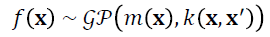
The specific regression approach we use is Gaussian processes (GPs). 3 GPs are very flexible and can represent functions as simple as linear input-output dependences or as complex as general nonlinear functions requiring an, in principle, infinite number of parameters, which makes them ideal for our purposes. The complexity depends on the covariance k(x,x'), which represents the prior correlation of function values for different inputs x and x'. The mean function m(x) is taken as identically zero throughout, as is commonly done in GP regression.[3] Note that this does not imply that we cannot represent systematic input-output dependencies; Figures 1-3 below show clearly that such dependences are captured. The effect of assuming a zero mean function can be seen most simply in the context of the linear kernel to be described shortly, where we effectively model the outputs as linear combinations of the inputs (plus constants), and place a Gaussian prior distribution over the parameters in each linear combination. The assumption m(x)=0 then amounts to saying that we have no strong a priori knowledge about the sign of the parameters, and hence use Gaussian priors with zero mean.
LINEAR KERNEL
The initial model choice was very simplistic, with a linear kernel chosen as the covariance function:
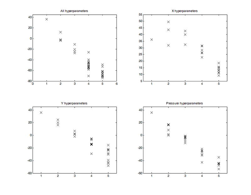
A GP defined by this kernel fits a constant plus a linear function of the inputs to the data. ∧ is a diagonal matrix with diagonal entries λ. These can be interpreted as inverse weights of different input components, meaning that a small λ corresponds to an input being an important predictor of the output. This GP has 18 hyperparameters per participant: 4 inverse weights (λtime, λfrequency, λintensity, and λloudness), an offset (σƒ), and a noise level (σ) for X, Y and pressure.
LINEAR PLUS SQUARED EXPONENTIAL KERNEL
Next, a more complicated model was implemented to capture more of the variability in the data. The same analysis technique was used as for the first GP, with the addition of an automatic relevance detection (ARD) squared-exponential (SE) term to the covariance function. This contributes one length-scale parameter per input direction, with the overall covariance kernel of
The key property of the additional contribution to the kernel is that it allows the fit to contain not only constant and linear terms, but also arbitrary nonlinear functions that are, in principle, specified by an infinite number of parameters. ℒ is a diagonal matrix with diagonal entries ℓ. These can be interpreted as determining the distance over which the nonlinear contribution to ƒ(x) varies significantly for different input components, i.e. for distances below ℓ, this contribution is essentially constant. Thus, a large ℓ means that the input component is irrelevant to the variation of the nonlinear part of the regression function, in analogy to a large λ, which has the same meaning for the linear portion. The other additional hyperparameter, σα, regulates the amplitude of the nonlinear contribution to ƒ(x); small values mean an essentially linear fit. Overall, the above setup gives 33 hyperparameters per participant: 4 inverse weights (λtime, λfrequency, λintensity, and λloudness), an offset (σƒ), 4 lengths (ℓtime, ℓfrequency, ℓintensity, and ℓloudness), an amplitude (σα), and a noise level (σ) for X, Y, and pressure.
Results and Discussion
LINEAR REGRESSION MODELS
Model performance
In general, this set of models performed equally well for trained and untrained participants. However, though these models did a reasonable job at modelling average outputs, they were not accurately able to predict the extremes (see Figures 1, 2, and 3). The noise hyperparameters (Figure 4a, f, k) indicate the goodness of fit for the GPs; a smaller noise term means that more of the variance in the data was explained by the deterministic part of the input-output relation, i.e.ƒ(x), than by random noise. X had the best fit, as is evident from the lower noise hyperparameters shown in Figure 4a, and pressure had the worst fit of the three outputs (Figure 4k). In particular, these models correctly identified upward trends in Y, but vastly overestimated the resulting peaks (Figure 2). Overall, while the model does capture some of the trends, there is clearly room for improvement in the predictions of all outputs.
Hyperparameter interpretation
As explained above, the size of the optimised inverse weight indicates the relevance of each input to the output being modelled, with small λ indicating high relevance. For X, time was the most important input by far (Figure 4b), as is clear from the small inverse weight hyperparameters when compared to the other inputs (Figure 4c-e), as expected. Most participants drew from left to right at a relatively constant speed throughout. Time was considerably more relevant for the trained participants (as indicated by their lower λtime values), perhaps indicating that they were better able to keep track of the length of the stimulus (Repp, 1993; Küssner & Leech-Wilkinson, 2013). Frequency, intensity, and perceived loudness had similar levels of relative unimportance for X with no clear differences between the trained and untrained participants (Figure 4c-e).
For Y, frequency, intensity, and perceived loudness were all more important inputs than time (Figure 4g-j). Here, there is an observable difference between groups: frequency, intensity, and perceived loudness were all more relevant for the Y output in the trained group than in the untrained group. For trained participants, frequency appears to be the most important input for Y, as expected (Figure 4h). This trend is also apparent in the untrained group, but to a lesser extent. This may indicate that changes in frequency are more likely to affect drawings made by trained individuals, which is consistent with findings of prior studies that trained adults are more accurate in detecting changes in pitch than people with little or no musical training (e.g., Tervaniemi, Just, Koelsch, Widmann, & Schröger, 2004).
For pressure, perceived loudness was the most relevant input, especially for the trained group (Figure 4o). This fits with the 84% of participants who reported that they represented an increase in loudness of the musical stimulus by pressing down harder on their drawing. Intensity, frequency, and time were all of similar importance, though intensity and frequency were generally more important for the trained participants than for the untrained (Figure 4m-n).
These results are similar to those of the initial analysis (see above), presumably because only a linear covariance kernel was used. Consequently, fitting a GP with only a linear covariance function confirms previous findings from a linear regression, which is an important first step, but does not allow for further insights.
LINEAR PLUS SE REGRESSION MODELS
Model performance
The addition of a squared-exponential term in the covariance kernel produced a vast improvement in the performance of the GPs. For both trained and untrained participants the new GPs were relatively more accurate at predicting X (Figure 1) and pressure (Figure 3), with an average increase in log marginal likelihood (per datapoint) of 0.98 and 0.85, respectively. The increased ability of the model to capture the trends in the Y output is especially noticeable, with an average increase in log marginal likelihood of 1.22. The SE version of the model no longer overestimates peaks in the dataset and more accurately captures valleys (Figure 2).
The shift in values for the noise hyperparameters confirms these observations. For the linear model the averages of the noise hyperparameters were around 0.7 for Y and pressure and 0.4 for X (Figure 4). For the SE GPs, the noise levels dropped considerably, especially for Y. In these models, the highest noise hyperparameter for Y is 0.3 and the average noise value is 0.2 (Figure 5). Interestingly, the noise hyperparameters for Y are lower for the trained group, perhaps because they draw in a more predictable fashion. Even though pressure is still the worst-modelled of the three outputs, the overall noise levels are much lower with the addition of the SE kernel (Figure 5). Because of these results, we conclude that the improved model output is worth the extra computing time required. However, while the linear plus SE model captures more of the variability inherent in the data, it also produces 33 hyperparameters. These hyperparameters are optimised using 3,000 datapoints, so they are still quite well-determined by the data, meaning that adding more hyperparameters is a feasible option. On the other hand, one of the purposes of these analyses is to represent each participant in the hyperparameter-space and, given that there are only 71 participants in the study, having nearly half that many hyperparameters may indicate over-specification. Consequently, we shall continue to use the results from the simpler linear model, in addition, for some future analyses.
Hyperparameter interpretation
As for the linear model, the size of the inverse weight and length hyperparameters indicate the relevance of each input to the output being modelled. However, interpretation of these hyperparameters is not as straightforward, perhaps because the addition of the more powerful squared exponential kernel causes many of the linear hyperparameters to be less important in the overall model.
Again, time is the most relevant input for X for both groups (Figure 5), which fits with expectations. The trained group had a stronger relationship between time and X than the untrained group, especially in the linear portion of the kernel (Figure 5b). Another difference between the two groups occurs in ℓintensity, which implies that changes in intensity are more relevant to the prediction of X for the untrained individuals than for the trained (Figure 5i). In addition, in the GPs for X the trained group tended towards smaller values of σa, the amplitude parameter from the SE kernel (Figure 5f). This indicates that the drawings of the trained participants were better captured by the linear portion of the model than those by the untrained.
For Y, the linear hyperparameters have similar levels of relevance in both groups, which is unexpected (Figure 5l-o). There is some difference in the SE hyperparameters, however, though again the results are different from the purely linear model. Surprisingly, time comes out as being slightly more relevant to the prediction of Y than frequency, intensity, or loudness, especially in the untrained group (Figure 5q-t). This is different from what most participants self-reported and from what has been found previously. After time, frequency and loudness are the most relevant inputs for the trained participants and there are several participants for whom frequency is much more relevant than either intensity or loudness (Figure 5r-t). The trained group also has lower noise levels than the untrained, perhaps again implying that they drew in a more predictable manner (Figure 5k).
For the GPs with pressure as an output, a similar trend is observed of minimal differences between any of the optimised hyperparameters corresponding to the linear portion of the covariance function (Figure 5v-y). However, the linear hyperparameters are slightly more relevant for the trained than for the untrained group, implying that there is enough of a difference in the responses that different model types are able to capture the variability. In the SE hyperparameters, ℓtime is again the most relevant (Figure 5aa), though it is closely followed by frequency, intensity, and loudness among the trained participants (Figure 5bb-dd). In the untrained group, frequency is the next important input, but there is much more variability in the hyperparameters compared to the trained (Figure 5aa-dd).
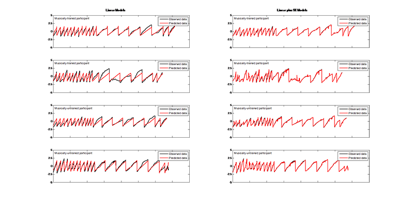
Fig. 1. (Enlarged view) Examples of observed X-coordinates (black) compared to predicted X-coordinates (red) using the linear GP regression model (left) and the linear plus SE GP regression model (right) for both musically-trained (top rows) and musically-untrained participants (bottom rows). The x-axis encompasses all stimuli strung together. The y-axis represents the scaled responses.
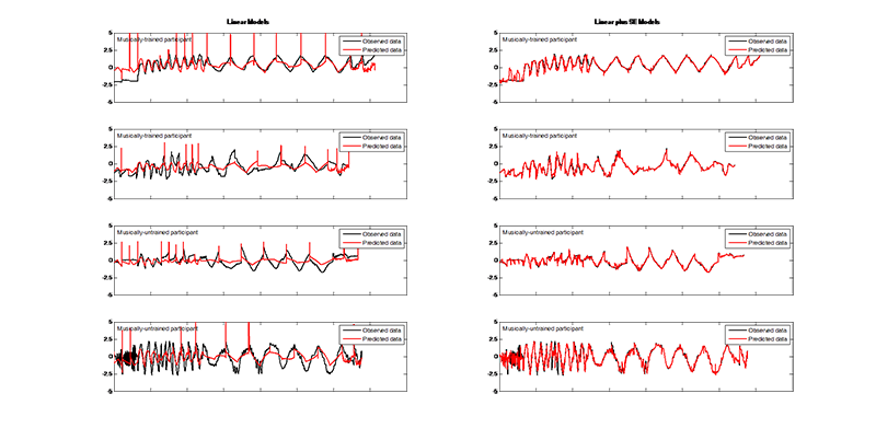
Fig. 2. (Enlarged view) Examples of observed Y-coordinates (black) compared to predicted Y-coordinates (red) using the linear GP regression model (left) and the linear plus SE GP regression model (right) for both musically-trained (top rows) and musically-untrained participants (bottom rows). The x-axis encompasses all stimuli strung together. The y-axis represents the scaled responses.
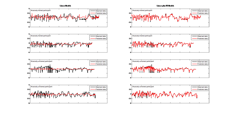
Fig. 3. (Enlarged view) Examples of observed pressure values (black) compared to predicted pressure values (red) using the linear GP regression model (left) and the linear plus SE GP regression model (right) for both musically-trained (top rows) and musically-untrained participants (bottom rows). The x-axis encompasses all stimuli strung together. The y-axis represents the scaled responses.
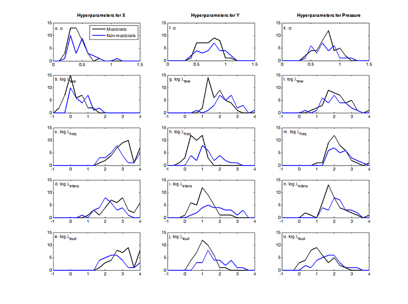
Fig. 4. (Enlarged view) Histogram showing the distribution of the optimised hyperparameters from the linear GP regression models with X (a-e), Y (f-j), and pressure (k-o) as outputs. This includes the noise hyperparameter σ (first row) and the logged covariance hyperparameters log λtime (second row), log λfrequency (third row), log λintensity (fourth row), and logλloudness (fifth row). Note that the covariance hyperparameters are plotted as logs the better to show their distribution, and that the noise and covariance hyperparameters are plotted on different scales. Colours indicate musically-trained (black) and musically-untrained participants (blue).
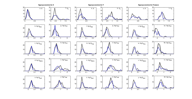
Fig. 5. (Enlarged view) Histogram showing the distribution of the optimised hyperparameters from the linear plus SE GP regression models with X (a-j), Y (k-t), and pressure (u-dd) as outputs. This includes the noise hyperparameter σ, the logged covariance hyperparameters logλtime and log ℓtime (second row), log λfrequency and log ℓfrequency (third row), log λintensity and log ℓintensity (fourth row), and log λloudness and log ℓloudness (fifth row), and the amplitude hyperparameter σα. Note that the covariance hyperparameters are plotted as logs the better to show their distribution, and that the noise/amplitude and covariance hyperparameters are plotted on different scales. Colours indicate musically-trained (black) and musically-untrained participants (blue).
The revealing of time as a particularly relevant input for all three outputs is quite surprising. Time was included to improve our ability to model X and it was not expected to be important for the other outputs. For example, visual inspection of the drawing dataset shows that Y varies considerably with time, sometimes increasing at the beginning of the stimulus, but also sometimes decreasing at the same point in time (or even circling). This encourages the notion that these results may depend on the method of pre-processing the data. Time was the only input that was normalised per stimulus; all other inputs were normalised across the entire data set. This unique scaling may have caused time to seem more important if it had been processed like the other inputs. In future work, it might be beneficial to investigate the effect of normalising each input individually, although considerable thought then needs to be put into understanding the effect on our ability to analyse a participant's responses across a variety of stimuli.
Although it is not always simple to pinpoint exactly what all the optimised hyperparameters reveal about the data, their main benefit is in simplifying the dataset. By running this GP analysis, we have created a 33-dimensional space in which each participant can be located, as opposed to the thousands of datapoints that previously corresponded to each individual. We can then feed these data into mathematical algorithms to discern underlying trends in the data, thus allowing the use of powerful analytical tools.
FURTHER ANALYSES AND LIMITATIONS
Due to nature of the GP regression models, traditional analytical steps are not always applicable. For example, the hyperparameters were initialised to be the same order of magnitude as the input data, but the particular initial values should not affect the overall outcome because the ideal hyperparameters are learned in the process of the marginal data likelihood optimisation: this 'training portion' of a GP is the model selection process (Rasmussen & Williams, 2006). Consequently, it is not reasonable to rerun the model with different parameters. In addition, the size of the training set is not relevant in this analysis, because instead of choosing to train the model on a portion of the data, all datapoints for each participant were used in the individual models. This is reasonable because the desired output is the set of hyperparameter values.
Though the SE version was relatively successful for this dataset, GPs are not without limitations. For example, in this analysis three different GPs were used for each participant so that each one only had to model a single output. While this is the traditional method (Rasmussen & Williams, 2006), it may be more informative to have one GP with all three outputs of interest. When one output is correlated with another, it is very useful to be able to use those outputs in each other's predictions, which is impossible with single-output GPs (Boyle & Frean, 2005). However, there are additional complications when setting up multiple-output GPs, such as the challenge of defining a covariance function kernel that gives the requisite positive definite matrix (Boyle & Frean, 2005).
CLUSTERING
Identifying possible subgroups and trends within the data, either at the level of trained versus untrained individuals or within broader groups, is the focus of attention in the second stage of analysis. There are a variety of mathematical techniques to pull out subgroups from a larger dataset and three of them are discussed here in order of increasing level of complexity. These techniques include exploratory data visualisation as well as explicit clustering methods. All analyses were performed on the hyperparameters extracted from the linear plus SE GP regression model.
Principal Component Analysis
Principal component analysis (PCA) 4 was conducted on the whole set of 33 hyperparameters, as well as separately on the subsets of 11 hyperparameters pertaining to the X, Y, or pressure outputs. The main result from the initial PCA was the clear identification of four of the 71 participants as outliers: participants 59, 67, 39, and 73 (figures not shown). Conducting PCA on subsets of the hyperparameters showed that each participant was an outlier for one or two particular inputs. For example, participant 59 is clearly an outlier with regard to the 11 X hyperparameters, but the other three participants are not. Similarly, participants 73 and 67 are outliers for Y, and participants 39 and 67 are outliers for pressure. These participants fall into both the trained and untrained groups. Further investigation of the hyperparameters suggests why these participants are so different. 5
Because the outliers from this initial run of PCA were skewing the projection such that it was impossible to determine any visual patterns, they were removed from the dataset and PCA was rerun using the remaining participants. While this made the spread of the data clearer, there were no clear patterns in the projected data. Consequently, PCA may not be the best method for understanding trends in this dataset and we moved on to a more complex analysis.
Spectral Clustering Analysis
Like PCA, spectral clustering 6 can produce a low-dimensional linear projection of the 33-dimensional hyperparameter space that captures as much of the variance inherent in the data as possible, but it also allows for non-linear projections (von Luxburg, 2007). The initial inputs to our spectral clustering analysis were the set of 33 hyperparameters per participant. For subsequent analyses, the 11-hyperparameters subsets were used. Overall, the first step of the spectral clustering analysis effectively reduced the dimensionality of the dataset from 33 (or 11) to 2. Note that for PCA we standardised all hyperparameters to have the same variance across participants, as otherwise large-variance hyperparameters would dominate the principal components. For spectral clustering we used raw hyperparameters, as the effects of standardization on any nonlinear structures that might be present in the data are less clear.
RESULTS AND DISCUSSION
The outliers from the PCA analysis fit in with the main group in the spectral clustering analysis, which implies that this is a better analytical technique for a dataset of this sort. Nonetheless, there are no clear clusters immediately visible in this projection (Figure 6).
We expect the participants on the extremes of the axis to show some sort of trend, but it was hard to verify this visually. For example, participants 60, 63, 3, 47, 27, and 48 are at the opposite end of the x-axis from 55, 33, 21, and 29, so one would expect their drawings to be relatively different. Most of the participants of the first group drew continuously in a zig-zag fashion (see CMPCP website) but note that this was not the case for participants 3 and 27. Similarly, most members of the second group produced dotted drawings, but this is not true for participant 55. The extremes on the y-axis range from participants 61, 53, 69, and 35 to participants 57, 9 and 64; however, visual inspection does not reveal clear distribution features. Moreover, it does not explain why participants 64 and 57 are also on an extreme of the x-axis but their drawings look nothing like those of participants 42 and 71 (see CMPCP website). We emphasise that the purpose of this cluster analysis is not solely to identify subgroups based on their obvious visual features. To achieve that, it would make more sense to classify the drawings manually according to the various drawing features one is most interested in (e.g. dotted lines). However, the clustering of these hyperparameters may reveal other meaningful patterns based on features impossible to identify visually, such as small changes in pressure or temporal aspects of the drawings. By applying spectral clustering analysis to only one output at a time, we may be able to clarify the results from spectral clustering of all the data.
Pressure hyperparameters
After running the spectral clustering analysis on the subgroups of hyperparameters, some interesting groupings appear. For example, the two groups of participants at opposite ends of the x-axis in the overall spectral clustering analysis are similarly grouped in the pressure analysis (see Figures 7a and 7d). In addition, the groups of participants found at the extremes of the y-axis in the overall analysis are also separated in the pressure analysis (see Figures 7a and 7d). Consequently, it is likely that the spread of some of the participants in the original spectral clustering analysis arises from their differing pressure hyperparameters, which is hard to pick up from a visual examination of the drawings.
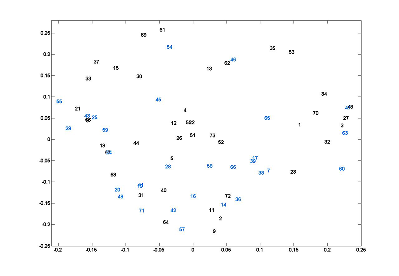
Fig. 6. (Enlarged view) Plot of each participant represented in the two-dimensional space created by the second and third eigenvalues of k = 3 spectral clustering using all 33 hyperparameters from the linear plus SE GP regression. The x-axis is the eigenvector associated with the second eigenvalue and the y-axis is the eigenvector associated with the third eigenvalue. The numbers refer to participants—black numbers are musically-trained, blue numbers are musically-untrained participants.
The main difference between the groups on the x-axis extremes is actually how well the GP regression was able to model their pressure output. While the left group has some of the smallest noise hyperparameters (ranging from 0.12 to 0.23), the right group has some of the largest among all the participants (between 0.39 and 0.63). The implication is that participants 60, 63, 3, 47, 27, and 48 responded to the sound stimuli in a more predictable manner with respect to the pressure output. However, both these groups have a mixture of trained and untrained participants, so the grouping is independent of that division.
X hyperparameters
Similar trends are visible in the spectral clustering analysis for the X hyperparameters. When using all hyperparameters, participants 53, 35, 69, and 61 are at the opposite end of the y-axis from participants 64, 57, and 9 (Figure 7a). In the X spectral clustering, these two groups are again at opposite extremes (Figure 7b). Examining the hyperparameters reveals that the second group has some of the smallest values for ℓintensity while the first group has the largest values of ℓintensity with an average of 0.88 compared to 0.18. While it was hard to pick up a relationship between participants 64, 57, and 9 with purely visual inspection, this analysis implies that these participants may be related in that they drew across the x-axis in response to some part of the stimulus that was not just the procession of time. This is not surprising for participants like 57 (see CMPCP website), who drew circles, but such a relationship is not immediately apparent from the drawings produced by participants 9 or 64 (see CMPCP website).
Y hyperparameters
For the most part, the groups identified in the overall spectral clustering analysis (Figure 7a) are mixed in the spectral clustering output from the Y hyperparameters (Figure 7c). The one exception is a slight trend placing participants 9, 64, and 57 towards the top of the y-axis while participants 53, 35, 69, and 61 are towards the bottom, but this distinction is not as clear as in the other spectral clustering results. The spread can be slightly explained by differences in ℓ time for the two groups (averages of 0.14 and 0.18, respectively), but because the overall spread of ℓ time across all 71 participants ranges from 0.07 to 0.29, this difference is not substantial.
These results imply that the distribution in the spectral clustering with all 33 hyperparameters (Figure 7a) may be more dependent on the X and pressure hyperparameters than those from the Y analysis. However, these analyses were conducted for k = 3 so that the end result produced two eigenvectors on which to plot. It is possible that if k were larger, the resulting distribution might be more related to the distribution of the participants when only the Y hyperparameters are taken into account; at any rate a larger k would likely discover different clusters. Overall, however, we suggest that spectral clustering analysis may be an improvement over PCA, and that the visual distribution of participants indicates whose hyperparameters are worth investigating more closely. On the other hand, because the embedding produced by spectral clustering is not a simple projection like PCA, the results are more challenging to interpret.
Gaussian Mixture Models
For the third clustering method, we investigated density modelling with Gaussian mixture models (GMMs). 7 A Gaussian mixture model represents a distribution of datapoints as a superposition of Gaussian distributions with different means (and covariance matrices), each of which can then be associated with a cluster found within the data. To make any statements about whether significant clustering exists one needs a method that determines the number of clusters in the data or, equivalently, the number of Gaussian components. This is provided by the variational Bayesian GMM method that we used. 7 The input data were the two-dimensional projections from the spectral clustering analysis described above.
As previously, the analysis procedure was performed four times, once with all the log-hyperparameters and one each with the subsets of hyperparameters for X, Y, or pressure—in all four cases after projection to two dimensions by spectral clustering.
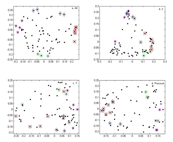
Fig. 7. (Enlarged view) Plot of each participant represented in the two-dimensional space created by the second and third eigenvalues of k = 3 spectral clustering using all hyperparameters (a) and using only the 18 hyperparameters from the linear plus SE GP regression for X (b), Y (c), and pressure (d). The x-axis is the eigenvector associated with the second eigenvalue and the y-axis is the eigenvector associated with the third eigenvalue. Each point is a participant. The shapes indicate the groups of participants that fall on the extremes of the overall spectral clustering analysis: blue diamonds are participants 35, 53, 61, and 69; red squares are participants 3, 27, 47, 48, 60, and 63; green circles are participants 9, 57, and 64; and pink stars are participants 21, 29, 33, and 55.
RESULTS AND DISCUSSION
The main benefit of the variational Bayesian approach is that it automatically selects the optimal number (k) of Gaussians to fit to the input dataset. However, in almost all cases the procedure only fitted one Gaussian, which does not identify subgroups (Figure 8a). The exception was the X analysis, where the optimal number was two (Figure 8a).
The two Gaussians fit to the X spectral clustering data by the VB analysis are shown in Figure 8b—a small cluster at the top and a much bigger cluster that attempts to cover the rest of the data. The smaller cluster is of most interest, especially the participants that fall with the standard deviation density contour, namely participants 15, 30, 37, 62, and 69, all of whom are trained participants. Clearly, there is some sort of consistent response from these participants (with respect to the sound stimulus and the x-coordinate of their drawings) such that they form a separate subgroup. They all have similar values for ℓ intensity, but so do all the other participants at the top of the y-axis, even those who do not fall within the cluster outlines. Four of them have similar values for λ time (though in the middle of the range, rather than at an extreme), but participant 69 is different enough to prevent this hyperparameter from being the sole reason. For the bottom group (2, 3, 7, 16, 24, 28, 40, 49, 59, 71, and 72, mostly untrained participants), ℓ intensity and σα are the only hyperparameters that might explain the cluster despite the fact that there is a lot of variability.
a. (Enlarged view) Plots of the final lower-bound ℓ (y-axis) from 50 random starts of the VB analysis versus the number of Gaussians (k) in the final result (x-axis) when using inputs derived from all hyperparameters and then only the hyperparameters for X, Y, or pressure. The largest ℓ indicates the best fit.
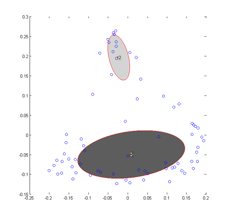
b. (Enlarged view) Gaussians fit to the X data using variational Bayes. The centres are the means of the two surviving mixture components and the outlines are the standard deviation density contours.
Fig. 8. Results from the variational Bayesian analysis
Thus, although intensity and time appear to be important predictors for X, this is neither clear from visual inspection nor from the values of the hyperparameters. What is remarkable, however, is the grouping of trained participants at the top and (mostly) untrained participants at the bottom. Our next analysis will thus examine whether it is possible to classify trained and untrained participants based on the drawing features represented by the set of hyperparameters.
CLASSIFICATION
GP classifiers were used to find an algorithm for determining whether a given participant is more likely to be trained or untrained. Other classification techniques could have been applied, such as support vector machines, but GP classifiers are a natural choice given the initial use of GP regression; they also provide estimates of uncertainty in the final classification. A GP classifier takes an input vector and predicts the probability with which it belongs to one of two classes. 8 GP classifiers were fitted for each participant by testing both the 18 log-hyperparameters from the linear model and the 33 log-hyperparameters from the linear plus SE model.
LINEAR CLASSIFICATION MODEL
As for the GP regression, the initial GP classifier model choice was simplistic. We assumed that the probability of the musically-trained class was a sigmoidal function (increasing monotonically from 0 to 1) of a 'hidden' function ƒ(x), the latter being modeled by a GP. The simplest case is again to use a linear covariance kernel for ƒ(x):
Because we fitted ƒ(x) as a constant plus linear function, the decision boundary between trained and untrained participants, defined by a threshold value for ƒ(x), will be a hyperplane.
LINEAR PLUS SE CLASSIFICATION MODEL
The second model was more complex with an additional isotropic squared-exponential term in the kernel for ƒ(x):
As in the original regression approach, this allows the hidden function ƒ(x) to contain nonlinear contributions. Note that because we only have 71 datapoints, one from each participant, it would not be viable to fit different length scales for different input directions, and ℓ is therefore taken as common to all directions.
Results and Discussion
The GP classifier was set up to predict the probability that each participant belongs to the musically-trained class. These probabilities can then be used to create a receiver operating characteristic (ROC) curve, as shown in Figure 9. Each point indicates a probability threshold directly related to a threshold for ƒ(x), going from 0 on the bottom left to 1 on the top right. Any participant with a probability above the threshold is assigned to the positive class (i.e. the musically-trained class) and then the ROC curve tracks how well the classifier is behaving. The true positive rate is the rate at which the model correctly places trained participants in the musically-trained class. The false positive rate is the rate at which the model incorrectly places untrained participants in the musically-trained class. A highly accurate classifier would produce a curve that stays very close to the upper left-hand corner, i.e. has a high rate of accurately classifying trained and a low rate of misclassifying untrained participants.
CLASSIFICATION USING HYPERPARAMETERS FROM THE LINEAR GP REGRESSION MODEL
From Figure 9a, it is clear that neither of the classifiers trained on the hyperparameters from the linear model accurately predicts whether a given participant is trained or untrained. This holds true for both the linear and SE versions of classifier.
CLASSIFICATION USING HYPERPARAMETERS FROM THE LINEAR PLUS SE GP REGRESSION MODEL
In contrast to the first two classifiers, the classifiers trained and tested with the SE hyperparameters are much more accurate at partitioning participants into the correct musically-trained or musically-untrained class, especially the classifier using a linear plus isotropic SE kernel. As shown in Figure 9b, at a probability threshold of 0.51, the true positive rate is 0.80 while the false positive rate is only 0.20. This means that given inputs from 100 trained participants the model would correctly classify 80 as trained, and given inputs from 100 untrained participants the model would correctly classify 80 of those (100 - 20) as belonging to the untrained group.
The inaccuracies in this classifier are probably related to the inputs (i.e. the SE hyperparameters) rather than to the design of the classifier itself. As discussed above (and seen in Figure 5), there are not always clear differences between the optimised hyperparameters for the trained compared to those for the untrained participants. This most likely indicates a trend inherent in the dataset (i.e. people are not completely predictable!), rather than a failing of the GP regression models.
Nonetheless, this means that any classifier is going to misclassify some of the participants who fall on the border between the two groups. Even though the linear plus SE classifier is not perfect, it is reasonably accurate and can consequently be used to predict whether an unknown drawing was made by a trained or untrained participant.
SUMMARY AND CONCLUSIONS
Overall, even though the techniques used in this study are more complicated than those in the previous analysis of this dataset (Küssner & Leech-Wilkinson, 2013), the additional programming and computing time is decidedly worth it for the richness of the produced output in terms of its ability to explain the data.
We were able to design a collection of regression GPs that adequately fit the data. Some of the results from the GP regression fit with our expectations, e.g., time as the most relevant input for X or lower noise levels for the trained participants (which implies that they drew in a more predictable manner), but others such as the importance of time for Y and pressure were surprising. At this stage, it remains unclear whether this is due to the pre-processing of the time vector or whether this is a genuine trend in the data. Nevertheless, it illustrates the importance of applying advanced techniques to this dataset, since these trends were not apparent in the previous linear regression analysis.
The main benefit of these analytical techniques is the creation of hyperparameters that give a numerical way to look at responses, similarities, differences, and subgroups of participants that we cannot see by visual inspection. The hyperparameters allow us to understand why a participant is different or to find outliers that cannot be identified only by their drawings. To that end, it is worthwhile to fit more complicated GPs to the dataset, both because the richness of the optimised hyperparameters greatly increases the analytical possibilities and because the more complex models fit the data much better.
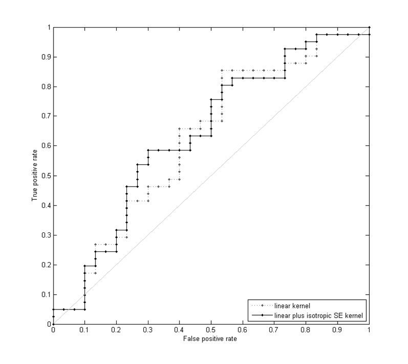
(a) (Enlarged view) ROC curve for the two GP classifiers trained using the 18 hyperparameters from the linear GP regression model. The area under the curve is 0.624 for the linear kernel and 0.638 for the linear plus isotropic SE kernel.
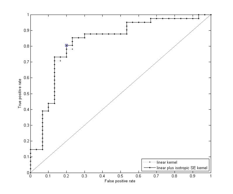
(b) (Enlarged view) ROC curve for the two GP classifiers trained using the 33 hyperparameters from the linear plus SE GP regression model. The square point indicates the optimal probability threshold for classification of 0.51 using a linear plus isotropic SE kernel. The area under the curve is 0.827 for the linear kernel and 0.829 for the linear plus isotropic SE kernel.
Fig. 9. ROC curves for the GP classifiers
Though the clustering analysis was inconclusive, that is most likely indicative of trends (or lack thereof) within the dataset itself, rather than deficiencies in the methods used. The spectral clustering analysis provides a visualisation of the distribution of participants and allows for the examination of groups or of participants on the extremes that allow us to understand some of the variation and differing responses. Finally, the classification analysis revealed that differentiation between drawings produced by trained and untrained individuals is possible, even if the formal cluster analysis was less successful. There is thus an observable difference, possibly manifested in various characteristics of both the product and process of the visual shaping, in the way in which musically-trained and untrained participants approach this task.
By fitting individual GPs and then focusing the rest of the analysis on the optimised hyperparameters, we were able to work with a set of data that is consistent across, and inclusive of, all participants, regardless of their conscious strategies of visualising sound and music. However, there are improvements to this method that are worth considering, ranging from altering the methods for pre-processing the data to refining the design of the GPs to account for correlations among the multiple output variables. One could also consider a range of alternative clustering techniques, such as k-means applied directly on the spectral clustering embedding, and statistical techniques other than classification for assessing differences between the hyperparameters of the musically-trained and untrained groups. As with any analysis, choices for initial parameter values, e.g., in the hyperparameter optimisation, could also affect the results. Future projects could focus on aspects of the data that were neglected in this study, such as subgroups created by age, amount of practice, or musical instrument. In addition, it would be worthwhile to compare participants' verbal reports about how they thought they drew in response to the various input features of this analysis (i.e. frequency and loudness) with the hyperparameters fitted to each participant by the GP model.
With the present set of analyses, we have provided starting points for future studies concerned with time-dependent aspects of cross-modal perception, complementing what is currently reported in the music-psychological literature (e.g. Schubert, 2004; Vines et al., 2006; Caramiaux et al., 2010; Nymoen, Torresen, Godøy, & Jensenius, 2012) and aiming at creating a broader variety of analytic tools that can be used to approach data from several angles.
NOTES
Seventy-three participants took part in this study. However, two participants had to be excluded from the analysis because they provided conflicting information regarding their musical training and current musical activity.
Return to TextThough perceived loudness and intensity are highly correlated, perceived loudness also incorporates frequency. Consequently, different intensities can correspond to the same perceived loudness, depending on the frequency of the stimulus; this concept is referred to as equal-loudness-level contours (Takeshima & Suzuki, 2004). As a result, perceived loudness is a better measure when pure tones are being used.
Return to TextA Gaussian Process (GP) is a stochastic process generalised from a Gaussian distribution; while a Gaussian distribution is a distribution over vectors, a Gaussian process is a distribution over functions (Rasmussen & Williams, 2006). Essentially, a GP is a collection of random variables where any finite number of the variables has a joint Gaussian distribution (Rasmussen & Williams, 2006). GPs can be a powerful tool for regression and have several advantages over traditional analysis techniques, including the ability to extract useful information from datasets where linear regression is not sufficient (Rasmussen & Williams, 2006), as is the case for this dataset. For many datasets, GPs are more accurate than parametric models (Seeger, 2004). Bayesian GP methods can also perform better than support vector machines, due to the adjusting of hyperparameters using nonlinear optimisation (Seeger, 2004). In addition, because GPs are completely specified by a mean function and covariance function, they can be used to define a distribution over functions without committing to a specific functional form (Rasmussen & Nickisch, 2011b).
Given a dataset D = {(xi, yi)|i = 1, …, n} with n observations of inputs x (in a D-dimensional vector) and outputs y, we want to predict a new output y* for novel inputs x* by finding an underlying function f. For Gaussian processes, we make the assumption that a prior function ƒ(x) that relates inputs and outputs is distributed according to a Gaussian process, symbolically written as
using specified mean and covariance functions

Intuitively, this prior assumption means that, on average, we would expect our findings to look like m(x) and that any deviations from this baseline are correlated in space according to the covariance function k(x,x' ).
To use GPs in analysis, a prior is specified with initial hyperparameters and then the training data is used to update that prior to get the posterior distribution (Rasmussen & Williams, 2006). By assuming a Gaussian likelihood in combination with a Gaussian process prior, the posterior will also be Gaussian (Rasmussen & Williams, 2006). To infer the hyperparameters, the log marginal likelihood (i.e. the probability of the data given the current hyperparameters) is computed and then optimised using partial derivatives to learn the values of the hyperparameters. Maximising the log marginal likelihood avoids over-fitting by including a complexity penalty term (Seeger, 2004; Rasmussen, 2004).
For the computational implementation, we used the GPML toolbox (Rasmussen & Nickisch, 2011a), available for MATLAB. All input and output variables were standardised across the entire dataset to have zero mean and unit variance. The inference method used for all models was infExact (exact inference for a GP with a Gaussian likelihood), which exactly computes the mean and covariance of a multivariate Gaussian using matrix algebra (Rasmussen & Nickisch, 2011b). As all the hyperparameters are positive, we work in the numerical optimisation with their logarithms so that the positive constraints are automatically satisfied. The initial values for the hyperparameters were chosen as 1 for all λ and ℓ, 2 for σƒ and σa, and 0.1 for σ.
Return to TextPrincipal component analysis (PCA) aims to reduce the dimensionality of a dataset without sacrificing the variability. PCA creates components that are linear combinations of the input variables and then ranks these components by their ability to explain the variability inherent in the original data. Because these new components are uncorrelated, a few dimensions can still capture a large percentage of the initial variability. For a vector x of n random variables, PCA finds a linear function
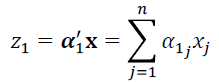
with the maximum possible variance (Jolliffe, 2002). Next, PCA finds a second linear function z2 = α'2x that is uncorrelated with α'1x and again has the maximum variance possible, and so on. Each zk is a principal component. Given the covariance matrix ∑ of x, the kth principal component is zk = α'kx where αk is the eigenvector that corresponds to the kth largest eigenvalue of ∑ (λk) (Jolliffe, 2002).
PCA was conducted using the stats package in R 2.10.1. The data were standardised prior to analysis so that each log hyperparameter was transformed to have zero mean and unit variance across all 71 participants.
Return to TextThe main reason for the outlier status of participant 59 (the X outlier) is that λtime was an order of magnitude larger than for all 70 other participants. In addition, participant 59 also had the largest λfrequency, λintensity, and λloudness, the largest amplitude from the SE kernel (σα) as well as the smallest offset (σƒ ). The noise parameter (σ) was average, indicating that the optimised GP for participant 59 was not exceptionally good or bad, but just different from all other participants. The large difference in λtime suggests that this participant represented time in a different manner from all the others and closer inspection of their drawings confirms this. Most participants drew continually across the x-axis throughout the length of the musical stimulus, which is why λtime is the most important input in the X models. Participant 59 also drew continually across the x-axis (rather than drawing circles or other abstract shapes as some participants did), but sometimes in the opposite direction. While the majority of participants moved from left to right each time, participant 59 only drew from left to right for 12 out of the 20 drawings and instead did a variety of things, including drawing from right to left or switching direction mid-drawing. At any rate, because this drawing interpretation was different from the majority of the others, participant 59 stands out as being an outlier when looking at the hyperparameters for X.
The reason for the Y outliers (participants 67 and 73) is less clear. Inspection of the hyperparameters reveals that these two participants have the largest λtime, λfrequency, λintensity, and λloudness (with participant 73's inverse weights being largest overall), indicating that the linear portion of the covariance kernel is unimportant in their models. In contrast, their noise hyperparameters and the hyperparameters from the SE portion of the covariance function are average for the group as a whole, with the exception of ℓtime for participant 67 which is the largest in the dataset. Both participants are trained, but visual inspection of the drawings does not give a clear explanation as to why these participants are outliers from the rest of the group, so further analysis may be necessary.
Participants 39 and 67 (the pressure outliers) are unique in that they seem to be outliers for different reasons. Participant 39 (untrained) is at one extreme while participant 67 (trained) is at the other. As with the Y outliers, all the λs from the linear portion for these two participants are the largest overall. Participant 69 also has very large length parameters from the SE portion of the kernel, with the largest ℓtime and ℓintensity, second largest ℓloudness, and one of the largest ℓfrequency. Because participant 67 also has the largest noise hyperparameter (σ), this participant is most likely an outlier because the GP is not a very good predictor. In contrast, participant 39 has some of the smallest ℓintensity and ℓloudness and also has a small σ, indicating that perhaps this participant is an outlier due to a strong correlation between the loudness and intensity of musical stimulus and the pressure output that led to an optimised GP where the inputs are much more important than the underlying noise level.
Return to Text-
Spectral clustering is a dimensionality reduction technique that can be much more effective than PCA or k-means (von Luxburg, 2007). The set-up for spectral clustering involves the undirected similarity graph G = (V,E) where V = v1,…,vn and each vertex vi corresponds to a datapoint xi. If the similarity between xi and xj is above a threshold, vi and vj are connected with an edge weighted by wij≥0. For wij = 0, vi and vj are not connected. These weights then form a weighted adjacency matrix W = wij)i,j = 1,…,n. The degree matrix D is a diagonal matrix with diagonal entries d1,…,dn where the degree of vi is di = ∑nj=1wij. There is a variety of techniques that can be used to construct the initial similarity graph (von Luxburg, 2007). Also required for spectral clustering is the graph Laplacian matrix. This can be defined in several forms, as either unnormalised (L := D - W) (von Luxburg, 2007) or normalised (Lsym :=D-½ L D-½ = I − D -½W D -½ or Lrw := D-1 L = I - D-1 W) (Chung, 1997).
There are three main spectral clustering algorithms, all of which take the same inputs (a similarity matrix S ∈ ℝnxn and a number k of desired clusters) and produce the same output (clusters A1,…, Ak for Ai = {j|yi ∈ Ci} (von Luxburg, 2007). This occurs through two steps: spectral embedding by computing k eigenvectors of the graph Laplacian, then using the values in the eigenvectors to feed into a clustering algorithm. The detailed steps vary, though each method starts with constructing a similarity graph G = (V,E) with a weighted adjacency matrix W (von Luxburg, 2007).
For the spectral clustering in this analysis, the algorithm then proceeds as follows:
- Compute unnormalised Laplacian Lsym and the first k generalised eigenvectors u1,…,uk of the generalised eigenproblem Lu = λDu as columns in matrix U ∈ ℝnxk
- Let yi ∈ ℝk be row vector for i = 1,…,n row in U
- Cluster points (yi)i=1,…,n in ℝk into clusters C1,…,Ck, typically using the k-means algorithm, though other clustering algorithms could be applied (von Luxburg, 2007)
For the computational implementation, we used a MATLAB toolbox by Chen, Song, Bai, Lin & Chang (2011) with a sparse similarity matrix built using the t-nearest-neighbours algorithm and a self-tuning technique for σ. We used the Shi and Malik normalised spectral clustering algorithm (Shi & Malik, 2000). For ease of visualisation, k was set to 3, meaning that the algorithm will produce three eigenvectors, the second and third of which were employed as the axes of the projection. (Note that the eigenvalue associated with the first eigenvector is 0 and the eigenvector is constant, hence it is not useful as a projection coordinate.) Spectral clustering was conducted using the log hyperparameters without prior standardisation in order to capture any non-linear structure in their distribution.
Return to Text Gaussian mixture models (GMMs) refer to the fitting of multiple Gaussians atop a dataset. Given data D = {xi|i = 1,…,n} sampled from some distribution p(x), we want to find an approximation to p(x)and consequently identify clusters in the data.
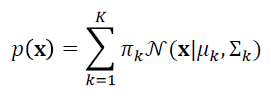 where πk is the prior probability.
Variational Bayes (VB), also known as variational inference, is one method for fitting GMMs that can be an improvement over the common maximum likelihood (ML) solution. VB reduces singularities and over-fitting compared to ML, as well as allowing the determination of the optimal number of components (Bishop, 2006). Rather than being an exact inference method, VB approximates the posterior probabilities. For observations x and latent variables z, mean-field variational Bayes uses the following equations (Bishop, 2006):
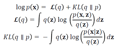
The optimal output is that which maximises ℒ(q), the lower-bound of the marginal likelihood, which is achieved by optimising with respect to q(z). VB fits a prior distribution over the parameters and estimates the hyperparameters; generally one uses broad priors to compensate for not knowing the parameter values. VB cycles between two steps that are analogous to the E and M steps of the ML algorithm and outputs the number of components with mixing values that are different from the prior values (Bishop, 2006).
Variational Bayes GMMs were run in MATLAB using the gmmVBEM function by Khan (2007) which implements the algorithms described by Bishop (2006). The initial GMM was constructed using the gmmem function in the netlab package (Nabney & Bishop, 2012) and initialised with two dimensions, one centre, and a full covariance matrix. The algorithm uses a symmetric Dirichlet prior. The prior parameters included the prior over the mixing coefficients (α0), the prior over the Gaussian means (m0), the prior over the Gaussian variance (β0), and two prior variables for the Wishart distribution (W0 and v). For this analysis, the priors were set as follows: α0 = .0001, m0=0, β0= 1, W0 = 200I and v = 20. The maximum number of iterations allowed was 100. The maximum number of mixture components (k) was set between 1 and 5; 50 random restarts were run for each k.
Return to TextThe basic technique for using GPs as a probabilistic classification tool is similar to GPs for regression, but with some modifications. For a model with discrete class labels, a non-Gaussian likelihood must be used (in contrast to the Gaussian likelihood used in the GP regression model) and consequently the posterior is also non-Gaussian (Rasmussen & Williams, 2006). Though exact inference is possible in principle, it is too computationally expensive to be feasible. For our data, Laplace's approximation was chosen as the alternative inference method.
Implementation proceeded using the GPML toolbox, using the Laplace approximation for inference. The classifier models were trained and tested using five-fold cross validation. Essentially, a model was trained on four-fifths of the data and the resultant hyperparameters were used to predict the class for the remaining one-fifth of the dataset, meaning that five separate sets of optimised hyperparameters were used. The initial values for the hyperparameters were chosen as 2 for α and σƒ and as 1 for all λ and ℓ.
Return to Text
REFERENCES
- Bamberger, J. (1995). The Mind Behind the Musical Ear: How Children Develop Musical Intelligence. Cambridge, MA: Harvard University Press.
- Bishop, C.M. (2006). Pattern Recognition and Machine Learning. New York, NY: Springer.
- Boyle, P. & Frean, M. (2005). Dependent Gaussian processes. In: Y. Bottou, L. Saul, & L.K. Weiss (Eds.), Advances in Neural Information Processing Systems 17: Proceedings of the 2004 Conference. Cambridge, MA: MIT Press, pp. 217-224.
- Caramiaux, B., Bevilacqua, F., & Schnell, N. (2010). Towards a Gesture-Sound Cross-Modal Analysis. In: S. Kopp & I. Wachsmuth (Eds.), Gesture in Embodied Communication and Human-Computer Interaction (LNCS). Berlin: Springer, pp. 158-170.
- Chen, W.-Y., Song, Y., Bai, H., Lin, C.-J., & Chang, E.Y. (2011). Parallel spectral clustering in distributed systems. IEEE Transactions on Pattern Analysis and Machine Intelligence (PAMI), Vol. 33, No. 3, pp. 568-586.
- Chung, F. (1997). Spectral graph theory (Vol. 92 of the CBMS Regional Conference Series in Mathematics). Conference Board of the Mathematical Sciences, Washington.
- Godøy, R.I., Haga, E., & Jensenius, A.R. (2006). Exploring music-related gestures by sound-tracing. A preliminary study. Paper presented at the 2nd ConGAS International Symposium on Gesture Interfaces for Multimedia Systems, University of Leeds, UK.
- Godøy, R.I., & Leman, M. (2010). Musical Gestures: Sound, Movement, and Meaning. New York: Routledge.
- Gritten, A., & King, E. (2011). New Perspectives on Music and Gesture. Aldershot: Ashgate Press.
- Gromko, J.E. (1993). Perceptual differences between expert and novice music listeners: A multidimensional scaling analysis. Psychology of Music, Vol. 21, No. 1, pp. 34-47.
- Jolliffe, I.T. (2002). Principal Component Analysis, 2nd Edition. New York, NY: Springer.
- Khan, E. (2007). Variational Bayesian EM for Gaussian mixture models.
http://www.cs.ubc.ca/~murphyk/Software/VBEMGMM/index.html. - Küssner, M.B. (2013a). Music and shape. Literary and Linguistic Computing.
- Küssner, M.B. (2013b). Shaping music visually. In: A.C. Lehmann, A. Jeßulat, & C. Wünsch (Eds.), Kreativität - Struktur und Emotion. Würzburg: Königshausen und Neumann.
- Küssner, M.B., & Leech-Wilkinson, D. (2013). Investigating the influence of musical training on cross-modal correspondences and sensorimotor skills in a real-time drawing paradigm. Psychology of Music, 0305735613482022.
- Leman, M. (2007). Embodied Music Cognition and Mediation Technology. Cambridge, MA: MIT Press.
- Marks, L.E. (2004). Cross-modal interactions in speeded classification. In: G.A. Calvert, C. Spence, & B.E. Stein (Eds.), Handbook of Multisensory Processes. Cambridge, MA: MIT Press, pp. 85-105.
- Nabney, I., & Bishop, C. (2004). Netlab Neural Network Software, third release. http://www.aston.ac.uk/eas/research/groups/ncrg/resources/netlab/.
- Nymoen, K., Torresen, J., Godøy, R. ., & Jensenius, A. R. (2012). A Statistical Approach to Analyzing Sound Tracings. In: S. Ystad, M. Aramaki, R. Kronland-Martinet, K. Jensen, & S. Mohanty (Eds.), Speech, Sound and Music Processing: Embracing Research in India (LNCS). Berlin: Springer, pp. 120-145.
- Nymoen, K., Godøy, R. I., Jensenius, A. R., & Torresen, J. (2013). Analyzing correspondence between sound objects and body motion. ACM Transactions on Applied Perception, Vol. 10, No. 2, pp. 1-22.
- Rasmussen, C. E., & Nickisch, H. (2010). Gaussian processes for machine learning (GPML) toolbox. Journal of Machine Learning Research, Vol. 11, pp. 3011-3015.
- Rasmussen, C. E., & Nickisch, H. (2011a). Gaussian Process Regression and Classification Toolbox version 3.1 for gnu octave 3.2.x and MATLAB 7.x, 2011. http://www.gaussianprocess.org/gpml/code/matlab.
- Rasmussen, C. E., & Nickisch, H. (2011b). The GPML Toolbox version 3.1.
http://www.gaussianprocess.org/gpml/code/matlab/doc/manual.pdf. - Rasmussen, C. E., & Williams, C. K. I. (2006). Gaussian Processes for Machine Learning. Cambridge, MA: MIT Press.
- Repp, B. H. (1993). Music as motion: A synopsis of Alexander Truslit's (1938) Gestaltung und Bewegung in der Musik. Psychology of Music, Vol. 21, No. 1, pp. 48-72.
- Reybrouck, M., Verschaffel, L., & Lauwerier, S. (2009). Children's graphical notations as representational tools for musical sense-making in a music-listening task. British Journal of Music Education, Vol. 26, No. 2, pp. 189-211.
- Schubert, E. (2002). Correlation analysis of continuous emotional response to music: Correcting for the effects of serial correlation. Musicae Scientiae, Vol. 6, No. 1 (Special Issue 2001-2002), pp. 213-236.
- Schubert, E. (2004). Modelling emotional response with continuously varying musical features. Music Perception, Vol. 21, No. 4, pp. 561-585.
- Schubert, E., & Dunsmuir, W. (1999). Regression modelling continuous data in music psychology. In: S. W. Yi (Ed.), Music, Mind, and Science. Seoul: National University Press, pp. 298-352.
- Shi, J. & Malik, J. (2000). Normalized cuts and image segmentation. IEEE Transactions on Pattern Analysis and Machine Intelligence, Vol. 22, No. 8, pp. 888-905.
- Sloboda, J. A. (1984). Experimental studies of music reading: A review. Music Perception, Vol. 2, No. 2, pp. 222-236.
- Sloboda, J. A. (1985). The Musical Mind: The Cognitive Psychology of Music. Oxford: Oxford University Press.
- Spence, C. (2011). Crossmodal correspondences: A tutorial review. Attention, Perception, & Psychophysics, Vol. 73, No. 4, pp. 971-995.
- Stein, B. E., & Meredith, M. A. (1993). The Merging of the Senses. Cambridge, MA: MIT Press.
- Takeshima, H., & Suzuki, Y. (2004). Equal-loudness-level contours for pure tones. The Journal of the Acoustical Society of America, Vol. 116, No. 2, pp. 918-933.
- Tan, S.-L., & Kelly, M. E. (2004). Graphic representations of short musical compositions. Psychology of Music, Vol. 32, No. 2, pp. 191-212.
- Tervaniemi, M., Just, V., Koelsch, S., Widmann, A., & Schröger, E. (2004). Pitch discrimination accuracy in musicians vs. nonmusicians: an event-related potential and behavorial study. Experimental Brain Research, Vol. 161, No. 1, pp. 1-10.
- Verschaffel, L., Reybrouck, M., Janssens, M., & Van Dooren, W. (2010). Using graphical notations to assess children's experiencing of simple and complex musical fragments. Psychology of Music, Vol. 38, No. 3, pp. 259-284.
- Vines, B. W., Nuzzo, R. L., & Levitin, D. J. (2005). Analyzing Temporal Dynamics in Music: Differential Calculus, Physics, and Functional Data Analysis Techniques. Music Perception, Vol. 23, No. 2, pp. 137-152.
- Vines, B. W., Krumhansl, C. L., Wanderley, M. M., & Levitin, D. J. (2006). Cross-modal interactions in the perception of musical performance. Cognition, Vol. 101, No. 1, pp. 80-113.
- von Luxburg, U. (2007). A tutorial on spectral clustering. Statistics and Computing, Vol. 17, No. 4, pp. 395-416.
